Create Quicksight Dashboard

info
- Follow the steps mentioned below.
- Total time taken for this task: 20 Minutes.
- Pre-requisites: Create Materialized View
When you create a dashboard, the typical workflow looks like this:
- Create a new analysis.
- Add new or existing datasets.
- Choose fields to create the first chart. QuickSight automatically suggests the best visualization.
- Add more charts, tables, or insights to the analysis. Resize and rearrange them on one or more sheets.
- Use extended features to add variables, custom controls, colors, additional pages (called sheets), and more.
- Publish the analysis as a dashboard to share it with other people.
Dashboards come in a wide variety of designs, depending on what you do and the analytics that you need to do it well. Using QuickSight, you can interact with your data on a webpage or your mobile device. If you also subscribe by mail, you can see a static preview of it.
- Sign-in on the Amazon QuickSight at https://quicksight.aws.amazon.com/. Follow the screen prompts to sign in.
- Once you are signed in, the default page looks like this.

Use the following procedure to connect Retail dataset and create an analysis containing a line chart visual. This visual shows the total sales by month, and forecast for the next six months.
- Click
New analysisand clickNew Dataset. (Or, choose Datasets at left, and then choose New dataset.) - Choose Redshift Manual Connect.
- Below Screen will be appear

- Enter Data Source Name:
Retail - Choose Connection Type:
Public network - Enter Database server:
xxxxxx-wkr-DWH-NLB-ELB-xxxxxxxxxxxxxxxx.elb.us-east-1.amazonaws.comYou can get this hostname by going to the profile page ofretail_sales_transformed-<your-userid>dataset. - Enter Port:
5439 - Database name:
xxxxxx<--This is the last word in the 'JDBC Connection String' - Enter your Redshift Username and Password <-- Get this from 👤 icon at top corner of Amorphic --> Profile & Settings --> DWH Password
- Validate Connection and Create data source
- Select Schema: contain sets of tables as
workshop - Select Tables: contain the data you can visualize as
mv_retail_sales_<your-userid> - Select
Import to SPICE for quicker analyticsand then clickVisualize.
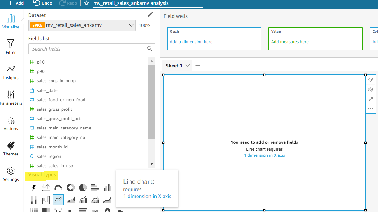
Choosing Visualize brings you to the screen where one can choose among the different visual types offered by Quicksight.
For this workshop, let's select Line chart as shown below.
- From the Fields list pane, drag
Sales_Date, and drop it to X axis. - Drag
P10, sales_cogs_in_nnbp , p90and drop it to Y axis.

Once analysis is completed it needs to be Published as a Dashboard in Quicksight. Follow the below steps:
- Click on Share at the top right of the screen.
- Choose Publish Dashboard.
- Provide the dashboard Name.
- Click Publish Dashboard.
- Choose the list of people to share the dashboard or click "Share with everyone in this account".
- Extract the Dashboard ID from the URL
To view all the dashboards, you can go to Dashboard Navigator on the Quicksight page and explore.
Congratulations!!!
You've created a Sales Prediction dashboard. Proceed to 'Connect Dashboard to Amorphic' task.