Build a dashboard using Apache Superset

info
- Prerequisite: Ingestion task and Create Morph Job.
- Click on
APPSfrom the left navigation-bar. - You should be able to see
workshop-superset-app. If you don't see it, contact your facilitator. - Click on
View Details. - App looks like the below screenshot.
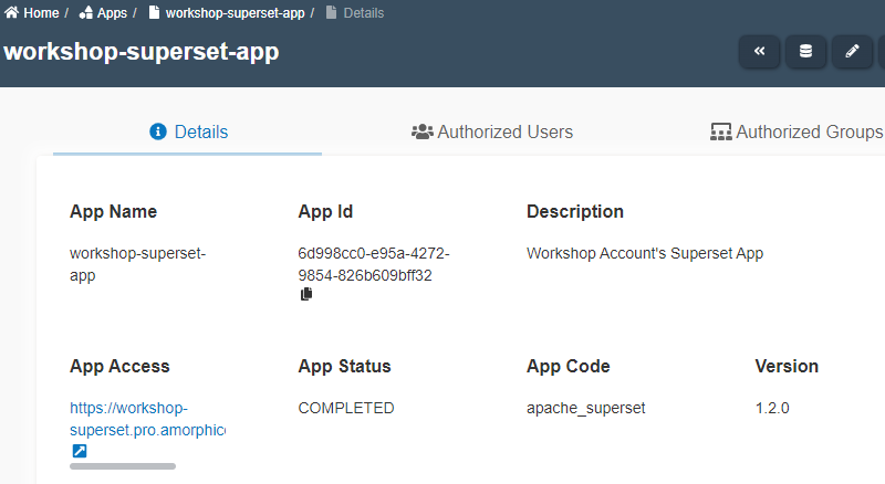
- Click on the link shown under
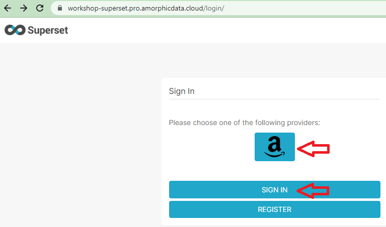
App AccessURL or here - Click on Amazon icon.
- Click on Sign in as shown below.
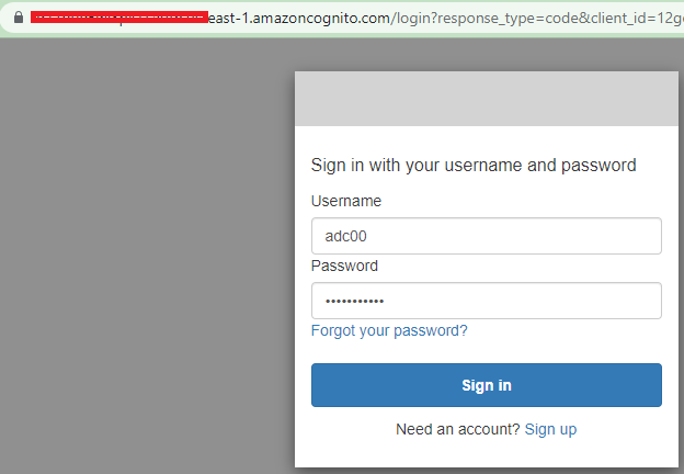
- Enter your Amorphic credentials as shown below and click sign in.
- Click on 'Data' menu and 'Databases'
- You should see the Database name
wsaar-custom-redshift-u_<your_userid>-db-wsaar. If you don't see the database, you should add your DWH password underAdd Superset Databasesof App details. Check facilitator for DWH password or reset it --> Click on 👤 icon at top right corner --> Profile & Settings --> Reset DWH Password --> Reset Password.
Run queries
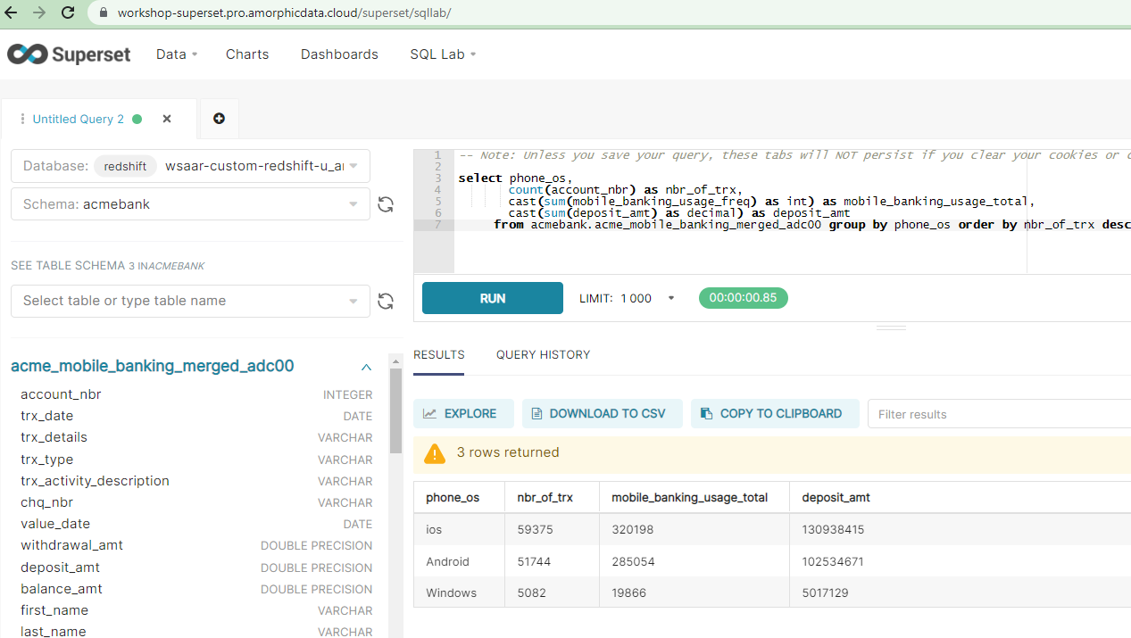
- Click on 'SQL Lab' menu and 'SQL Editor'.
- Select Schema as 'acmebank'.
- Select table as
acme_mobile_banking_merged_<your_userid>and check columns. - Copy and paste the following query and click 'Run'
select phone_os,
       count(account_nbr) as nbr_of_trx,
       cast(sum(mobile_banking_usage_freq) as int) as mobile_banking_usage_total,
         cast(sum(deposit_amt) as decimal) as deposit_amt
       from acmebank.acme_mobile_banking_merged_<your_userid> group by phone_os order by nbr_of_trx desc
- You will see result as shown below. You may download the result and save the query for later use.
Create Charts
- Before we can create charts, we need to add datasets.
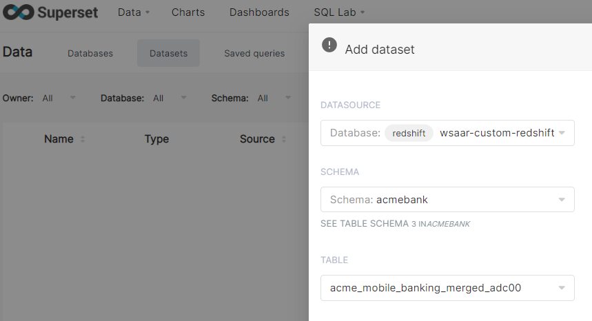
- Click on 'Data' menu and 'Datasets'.
- Click on '+Dataset' button at top right corner.
- DATASOURCE is autopopulated.
- Choose schema as
acmebank. - Choose table as
acme_mobile_banking_merged_<your_userid> - Click 'ADD' button as shown below.
- Click on 'Charts' menu.
- Click '+Chart' button at top right corner.
- Choose dataset as
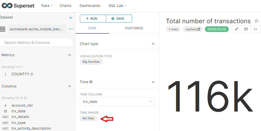
acme_mobile_banking_merged_<your_userid>. - Choose visualization type as big number.
- Click on CREATE NEW CHART.
- Change '-Untitled' to 'Total Number of Transactions'.
- Click on Time Range, Select 'No Filter' from dropdown menu and click 'Apply'.
- Click Run and Save as shown below.
- Let's create one more simple chart.
- Click on 'Charts' menu.
- Click '+Chart' button at top right corner.
- Choose dataset as
acme_mobile_banking_merged_<your_userid>. - Choose visualization type as bar chart.
- Click on CREATE NEW CHART.
- Change '-Untitled' to 'Number of Transactions by Phone OS'.
- Click on Time Range, Select 'No Filter' from dropdown menu and click 'Apply'.
- In the Series, type 'phone_os' and hit enter.
- Click run to generate the chart.
- Click Save as shown below.

Create a Dashboard
- Click on 'Dashboards' menu.
- Click '+Dashboard' button at top right corner.
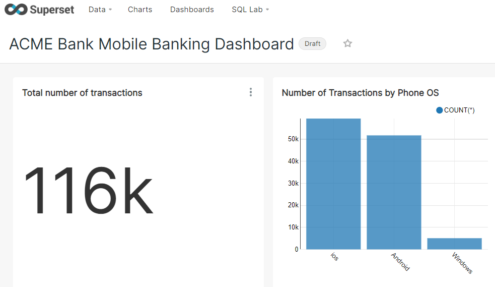
- Click on '[ untitled dashboard ]' to rename it to 'ACME Bank Mobile Banking Dashboard'
- Click on Charts on the right hand side box.
- Darg the two charts created above.
- Click Save. The Dashboard should look like this.
- You may create more charts and add them to the dashbaord.
Congratulations!!! 🎉
You've successfully completed all tasks of the Immersion day workshop.